Weather Analysis Project
Analyzing Climate Patterns Across Global Latitudes
Python
Matplotlib
Pandas
OpenWeatherMap
Geographic Analysis
Data Visualization
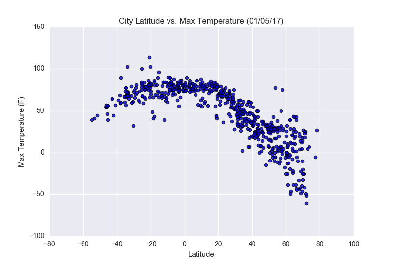
Latitude vs. Max Temperature
Key Findings
- Temperatures increase as cities approach the equator (0° latitude)
- Strong negative correlation between latitude and temperature in northern hemisphere
- Temperature distribution is more symmetric around the equator
- Southern hemisphere shows less temperature variation
This scatter plot shows the relationship between latitude and maximum temperature. As expected, cities closer to the equator (0° latitude) experience higher temperatures, while temperatures decrease as we move toward the poles.
Methodology: Data was collected from OpenWeatherMap API for over 500 cities worldwide. Matplotlib was used for visualization with custom styling.
Insight: The clear temperature-latitude relationship demonstrates the fundamental impact of geographic location on climate patterns.
Visualization Gallery
Click any visualization to view details
Max Temperature

Humidity

Cloudiness

Wind Speed
Project Features:
- Real-time weather data collection via API
- Geographic correlation analysis
- Interactive data visualizations
- Statistical correlation calculations
- Global climate pattern identification